Experiment 1# - Image navigation
The Goal
- Provide website navigation through overlapping and irregular shaped images
- Desaturate all elements not hovered
- Make it work on most screen sizes
Experiment #1 - Use of Clippy to create a visual navigation map.
Result
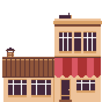
 Enter
Enter Menu
Menu Jukebox
 Magazines
How to
1. Create images for each zone seperately
Make sure to not have too much whitespace along the edged to make placement with css easier later on.
2. Set up your webpage
Use a #container to hold all your images. This will be your canvas, so choose your size wisely. Create a div the same size as the image for each zone containing a link. I recommend naming the zones after their content instead of .zone1, .zone2, etc Place the image as the background image.
#container
    .zone.zone1
        a
    .zone.zone2
        a
    .zone.zone3
a#container {
position: relative;
width: 650px;
height: 352px;
}
.zone {
position: absolute;
}
.zone a {
display: block;
text-indent: -999999px;
height: 100%;
width: 100%;
}
.zone.zone1 {
background-image: url(...);
position: absolute;
right: 0px;
bottom: 0px;
}
.zone.zone2{...}
.zone.zone3{...}Use position:relative; on your container and position: absolute; on your zones. Position your zones with css using top, bottom, left, right. Optional but recommended: Adjust sizes and positioning for each desired screensize using media queries: @media screen and (max-width:768px){...}
3. Use Clippy to create a clip-path around the image
This makes sure the hover doesn't get activated when hovering white space in the image. Apply the generated css to the zones.
4. Hover effects
I used this JSFiddle to affect sibling zones. Instead of fading out, I used filter: grayscale(100%); as the not:hover effect. Then I ran into the problem that when I hovered an empty zone in the #container, all my zones would turn gray. To solve this, I created a div containing a span the same size as the container underneath the zones and applied this CSS:
.zone.zone-bg {
    width: 100%;
    height: 100%;
    position: absolute;
  }

.zone.zone-bg span.empty-block {
    display: block;
    height: 100%;
}
#container:hover > .zone-bg:hover ~ .zone {
  filter: grayscale(0%);
}
What this basically means is that once I hover the zone-bg, all siblings with the class .zone turn fullcolor. This overrides the turning gray, so when hovering the whitespace the map keeps its color.
All images made by me specifically for Aegi's Cafe, please do not use them.